 |
| click to enlarge |
Showing posts with label Infographic. Show all posts
Showing posts with label Infographic. Show all posts
Tuesday, June 18, 2013
25 Things About Superman You Didn't Know
Virgin Movies put this infographic together prior to the release of Man of Steel, and I thought I would share it. And there are several things I didn't know. Like Gene Hackman refusing to cut his hair and Marlon Brando refusing to learn his lines. Pretty cool stuff. Check it out.
Monday, June 17, 2013
Healthy Recipe Substitutions
This is absolutely crazy. And I don't mean it in a negative way. I mean it in the sense that I never thought you could use prunes or avocado instead of butter, or vanilla extract instead of sugar. I've heard about some of the substitutions in this infographic, but a majority of them are new to me.
In in the end, this is all about having a healthier heart and living longer, so check it out. Click the infographic and visit Greatist for a clearer image.


In in the end, this is all about having a healthier heart and living longer, so check it out. Click the infographic and visit Greatist for a clearer image.
Thursday, June 6, 2013
Farm to Fork: The Story of Our Toxic Food System
Soooooo, not something we really want to read or see early in the morning, but yeah, pretty much everything we eat will give us cancer. And this lovely infographic provides you with every detail. Click on the image below to get the full picture. The infographic is brought to you courtesy of Healthychild.org.


Monday, May 13, 2013
The Evolution of "Star Trek" (Infogrpahic)
This is absolutely terrific. Especially if you're a Star Trek fan or just curious about the franchise in general. Thank you Space.com for sharing this amazing piece of work!
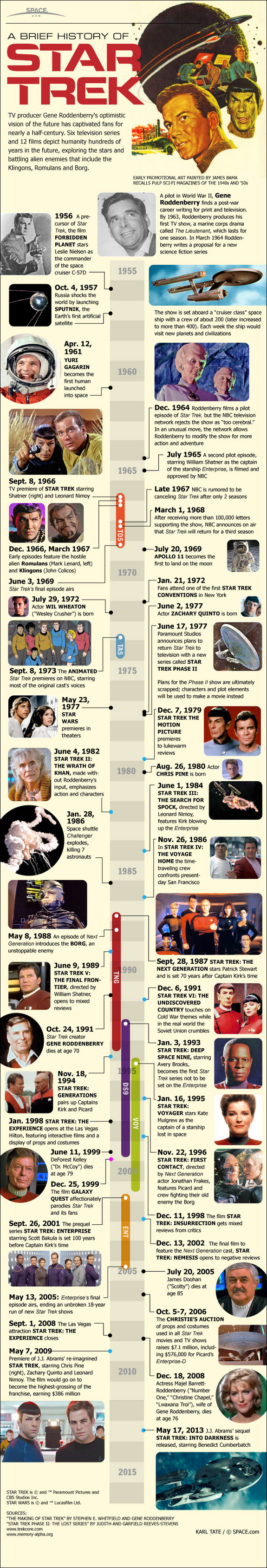
On Sept. 8, 1966, an American sciencefiction icon was born. The “Star Trek” television show lasted only three seasons, but spawned a lasting legacy that has stretched across decades and led to four spinoff live-action shows, a cartoon series and a dozen feature films.
Gene Roddenberry and his team set their show aboard the U.S.S. Enterprise, a sophisticatedA pilot episode starring Jeffrey Hunter was rejected by the NBC TVnetwork as “too cerebral” for a general audience. The show was retooled with William Shatner in the starring role of Captain James T. Kirk. Leonard Nimoy was featured as the alien officer Spock.
After its cancellation in 1969, the show grew even more popular, appearing several times per week (or even daily) in syndication.The Star Wars phenomenon of 1977 led Roddenberry to consider bringing the show back to television. Soon the plan changed, and “Star Trek the Motion Picture” appeared in 1979 to lukewarm reviews. Not wanting to waste their investment, the studio replaced Roddenberry at the helm and made several sequel films with much lower budgets.In 1987, Roddenberry created a new TV show from the ground up with an entirely new cast led by Patrick Stewart as Captain Jean-Luc Picard. “Star Trek the Next Generation” debuted directly into syndication, not appearing on any of the major TV networks. Its popularity grew slowly but eventually it became successful enough to spawn its own set of feature films.Three more TV series would follow: “Deep Space Nine,” “Voyager” and “Enterprise.” When the latter went off the air in 2005, an unbroken run of 18 years of Star Trek on television was ended.By 2009 Star Trek had faded from pop culture prominence, but a reboot movie, called simply “Star Trek,” changed all that. Director J.J. Abrams reimagined the original TV series, casting Chris Pine and Zachary Quinto in the lead roles of Kirk and Spock. The film became the highest-grossing of the franchise.In 2013, Abrams’ sequel “Star Trek into Darkness” features Benedict Cumberbatch as a terrorist villain.
Thursday, April 4, 2013
Gun Violence - The Bible Belt - A Sea of Red
I find it kind of ironic that the states with the most gun-violence, are in the states with the most - God-fearing, Muslim-hating, Republican-leaning, Gay bashing people in the country. Oh, and while we've had an increase of gun-violence in the state of Texas over the last several months - the state is huge, so that's why its suprisingly yellow.
 The National Rifle Association (NRA) and its allies in Congress frequently claim that gun violence is highest in places with the toughest crime laws. But a new study
from the Center for American Progress (CAP) suggests something closer
to the opposite is true — the states with laxer gun laws tend to be the
ones contributing the highest shares of national gun deaths and
injuries. [America Under The Gun]
The National Rifle Association (NRA) and its allies in Congress frequently claim that gun violence is highest in places with the toughest crime laws. But a new study
from the Center for American Progress (CAP) suggests something closer
to the opposite is true — the states with laxer gun laws tend to be the
ones contributing the highest shares of national gun deaths and
injuries. [America Under The Gun]

Friday, March 15, 2013
How Not To Get Stuck Next To Someone That Sucks
Pure genius. You've always had this problem. You arrive at a dinner party and don't know where to sit? If the table is a 4 person, circle it's pretty simple. But if you're talking about a 6 or 8 person rectangular table, things start to get difficult. How do you keep from getting stuck at the lonely side of the table, or sitting next to someone you particularly don't want to sit next to?
Well, Alex Cornell has given us some tips on choosing the right seat. Check out his infographic and explanation:

Well, Alex Cornell has given us some tips on choosing the right seat. Check out his infographic and explanation:
One of the most complex social situations you will encounter is the 45 seconds that elapse while deciding where to sit for dinner at a restaurant. Your choice should appear natural, unbiased and haphazard if executed properly. Timing is everything.
These 45 seconds determine how enjoyable your next 2 hours will be. Once the pieces start to fall into place and people take their seats, your choices narrow. People sit, seemingly at random, and if you don't take the appropriate measures, you're inevitably stuck at the least interesting end of the table.

4 Person Circle: This is the ideal setup. You are safe sitting in any seat. Regardless how interesting everyone is, you pretty much can’t go wrong. Note: as the diameter of the table increases, so too does the importance that you sit adjacent to someone you like.
4 Person Square: This configuration (as opposed to two chairs on each side) is less fraught with problems. Something to watch out for is diagonal conversations, i.e. breaking the into two parts and getting stuck with the more boring of the three tablemates.
6 Person Circle: How loud the restaurant is determines how important it is that you claim a middle seat. A quiet space allows for cross-table diagnoal talking, and generally one conversation. A loud space however forces multiple conversations and less diagonal.
8 Person Rectangle: To get one of the interior 4 seats, you need to time your approach expertly. You can’t be first, else you’ll be expected to file to the end. And you can’t be last, else you’ll be stuck with the least interesting seat at the table. Timing is everything.
7 Person Rectangle: It’s very easy to get screwed in this scenario. While it may appear like you can sit anywhere except the ends, this is not so. You are at risk of sitting next to the lonely end-seat, which requires you to speak soley to that person for the duration of the meal.
2 Tables of Any Size: You’re fucked. Regardless of how you time your approach, you will inevitably choose too soon. Lament as the other table’s attendance crystallizes into what is clearly the superior group. Sometimes it’s best to visit the bathroom while seats are chosen, so any seating disasters are the result of chance, and not your own miscalculation.
via alexcornell
Thursday, February 14, 2013
Today in Horrible Infographics: The Rise of Multi-Screen Content Consumpiton
Courtesy of Jason Oberholtzer

The article is really great, click the image or link above to read.
Wednesday, June 6, 2012
When Are Vegetables and Fruit In Season?
Ever wonder when your fruits and vegetables are in season? I do the grocery shopping in the household, and let me tell you... It sucks when the vegetables are not in season. Unless the items are genetically enhanced, i.e. a 3 foot cucumber compared to 8 inches, then more than likely you will be eating a cucumber around 4-5 inches in size.
Here are two great info-graphics to show you exactly when to buy those items. Unless all you care for is bananas, citrus fruit, onions, and celery - those are available year-round.


Here are two great info-graphics to show you exactly when to buy those items. Unless all you care for is bananas, citrus fruit, onions, and celery - those are available year-round.
Saturday, June 2, 2012
What the Contents of Your Fridge Say About You
I absolutely loved these info-graphics, because ironically enough, it makes some sense. LOL. According to the description, "You may not realize it, but your fridge is a gateway to all the various
nuances of your soul. Find your fridge description on the following
chart to come to terms with the reality of your inner being."
So which fridge are you? The All Natural? The Bad Ass? The Jar Head? LOL. Check them all out, they're pretty funny.


So which fridge are you? The All Natural? The Bad Ass? The Jar Head? LOL. Check them all out, they're pretty funny.
Thursday, May 17, 2012
Is Your Birthday Common?
I thought this infographic was pretty cool; I saw it on CNN a couple of days ago. Find your Month and Day of your birth and locate the color that closely matches your birthday rank (Less common or More common).
 My birthday is the same day as Prince Charles of England, November 14th - it's less common. But if I was to look at my niece, Liliana's birthday of September 19, it's definitely "Most common".
Monday, March 12, 2012
Things That Make You Go Hmmm... How The Sap Flows
For those who have no idea how Maple Syrup is produced, here's a sweet little chart to help you understand. It's pretty darn cool.

You may also want to read up on how syrup makers are having a hard time producing syrup this winter. Read full story here. It is definitely something that will that will make you go hmmm...
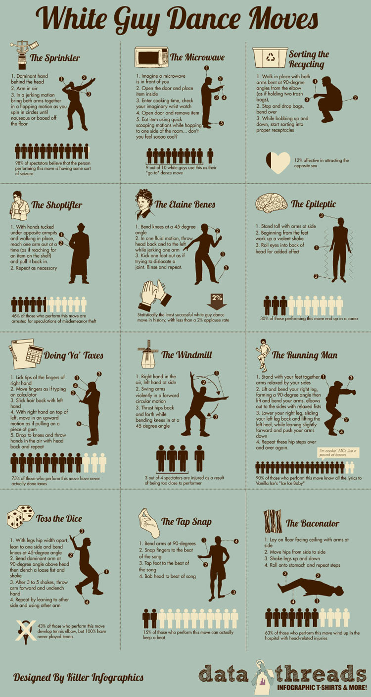
White Guy Dance Moves
If you're a white guy trying your best to fit in on the dance floor, then this wonderful infographic is just for you. Learn the "Toss the Dice", "The Microwave", "The Baconator", and many more dance moves made exclusively by you, for you!
 |
| click to enlarge |
Thursday, January 26, 2012
Doctor Doom's Armor
For all you comic geeks, I thought you'd like this post. It's an excellent infograph of Dr. Doom's Body Armor. I find it quite fascinating actually.
Not sure who is Dr. Doom? Read here.

Not sure who is Dr. Doom? Read here.

Click to Enlarge
Friday, January 20, 2012
Celebrity Pallbearers
I thought this infographic was pretty darn cool. For those who have no idea what a pallbearer is, the definition is underneath the title.
It took me a few seconds, but I was able to find out which celebrities carried Natalie Wood's casket. Some celebrities only had one fellow celebrity carry their casket, but in the case of Natalie, she had Fred Astaire, Laurence Olivier, David Niven, Frank Sinatra and Gregory Peck, all of which have died since then. It's pretty fascinating - click on the pic to see the full chart, or go to mysendoff.com.

It took me a few seconds, but I was able to find out which celebrities carried Natalie Wood's casket. Some celebrities only had one fellow celebrity carry their casket, but in the case of Natalie, she had Fred Astaire, Laurence Olivier, David Niven, Frank Sinatra and Gregory Peck, all of which have died since then. It's pretty fascinating - click on the pic to see the full chart, or go to mysendoff.com.
Wednesday, December 28, 2011
Christmas By The Numbers: The Infographic
Wow, this is pretty impressive when you consider the amount of time that's actually spent observing the day for what it's meant to be celebrated for.
350 Million future Christmas trees are being grown on farms at this very moment, because Americans buy 25-30 million trees each Christmas season. Wow. Mind boggling, isn't it?
350 Million future Christmas trees are being grown on farms at this very moment, because Americans buy 25-30 million trees each Christmas season. Wow. Mind boggling, isn't it?

Sunday, December 4, 2011
Get More Out of Google
 Hack College has come up with the following Infographic that I have posted on my blog on a permanent basis (located on the left sidebar). It provides tips and tricks for students wishing to do online research.
 A recent study has found that 3 out of students don't search Google efficiently, hell, I know people that could use help with Google. One example, "Don't ask Google questions. Think about how an answer would be phrased, and search for that(ie, never search for 'What is the air speed velocity...')."
Yes, you have people who are Google masters, and know every Google trick in the book, but most of us don't, so this definitely does help. Give it a try if you're doing a research paper, project, or just simply at home searching for useless information. Enjoy.
Tuesday, November 1, 2011
Politics 101: United Bases of America
Is the United States worried it will no longer be the World's Superpower? Not anytime soon, and this incredible infographic provided by the National Post, says otherwise. It's actually quite fascinating.
Despite the pending troop withdrawals in Iraq and those in Afghanistan between now and 2014, the United States remains a superpower on a scale not seen since the days of the Caesars. With this in mind, the National Post’s Richard Johnson takes a look at the scale of America’s forces.
 |
| click to enlarge |
Saturday, October 8, 2011
Stick vs. Automatic
Courtesy of Hunch and Column Five Media, I bring you this great infographic which uncovers the characteristics of people who can drive stick shifts and those who cant. Pretty interesting when you find that 69% of people who drive a stick are more likely to have a graduate degree and 39% more likely to be married or in a long-term relationship.
And try this one; If you cannot drive a stick-shift, you're part of the 32% of people who are pessimistic, 12% more likely to be an introvert, 11% more likely to be a night owl, 12% more likely to best express yourself through writing, and 15% likely to consider yourself close to nature. Hmm, I'm not mentioning any names, but I know someone just like this, and he can't drive a stick.

And try this one; If you cannot drive a stick-shift, you're part of the 32% of people who are pessimistic, 12% more likely to be an introvert, 11% more likely to be a night owl, 12% more likely to best express yourself through writing, and 15% likely to consider yourself close to nature. Hmm, I'm not mentioning any names, but I know someone just like this, and he can't drive a stick.
 |
| click to enlarge |
Subscribe to:
Posts (Atom)